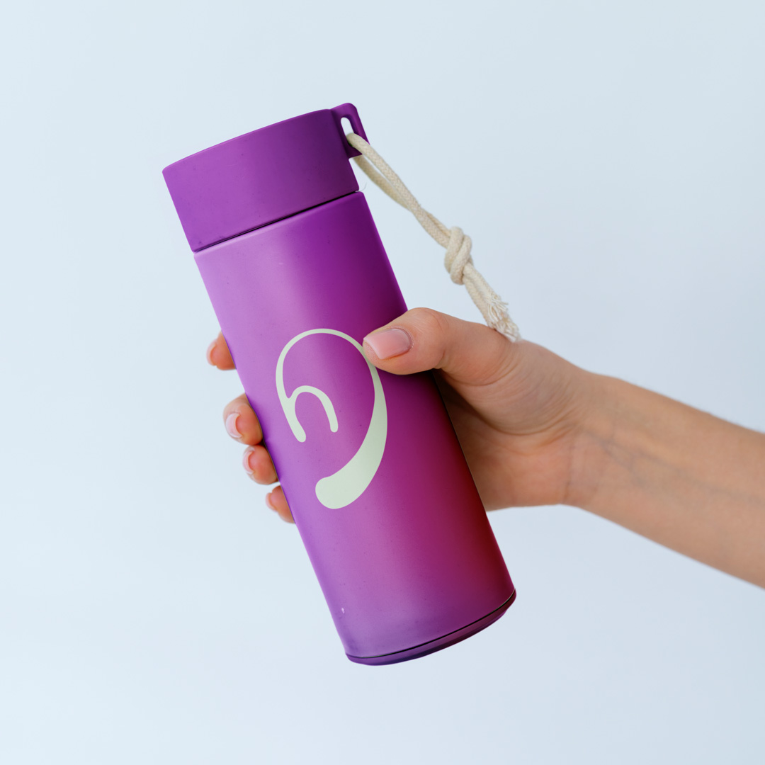
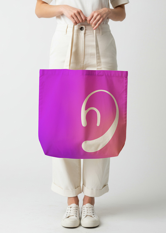
The Helga logo was designed to express the heart of the product, an assistive technology built to bridge communication between the Deaf community and the hearing world. Its form takes inspiration from the shape of an ear, abstracted into smooth, continuous strokes to symbolize accessibility, clarity, and human connection. The fluid inner curve references the natural motion of sign language, while the bold lower contour suggests alertness and protection, reflecting Helga’s feature of detecting important ambient sounds. Together, the mark becomes a universal symbol of inclusion and communication without barriers.
Each element of the logo works together to represent Helga’s purpose: enabling seamless understanding in both everyday conversations and urgent moments. The outer curve hints at listening and awareness, the inner stroke captures the gesture and rhythm of sign language, and the base form subtly mirrors a notification drop—an allusion to the app’s ability to capture sounds and alert users. This blend of audio, visual, and human-centric cues creates a brand identity that is both empathetic and technologically forward.
In application, the logo adapts easily across various mediums—from digital icons to presentation decks and promotional materials. Its simplified geometry ensures clarity even at small sizes, while its organic form complements expressive gradients and minimalist interfaces. These mock-ups demonstrate how the identity can support Helga’s storytelling: modern, intuitive, and built around helping users navigate the world with confidence and dignity.
More Things I’ve Worked On
Let’s Work Together
Have a project, campaign, or website in mind? I’d love to help bring it to life