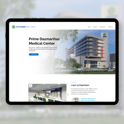
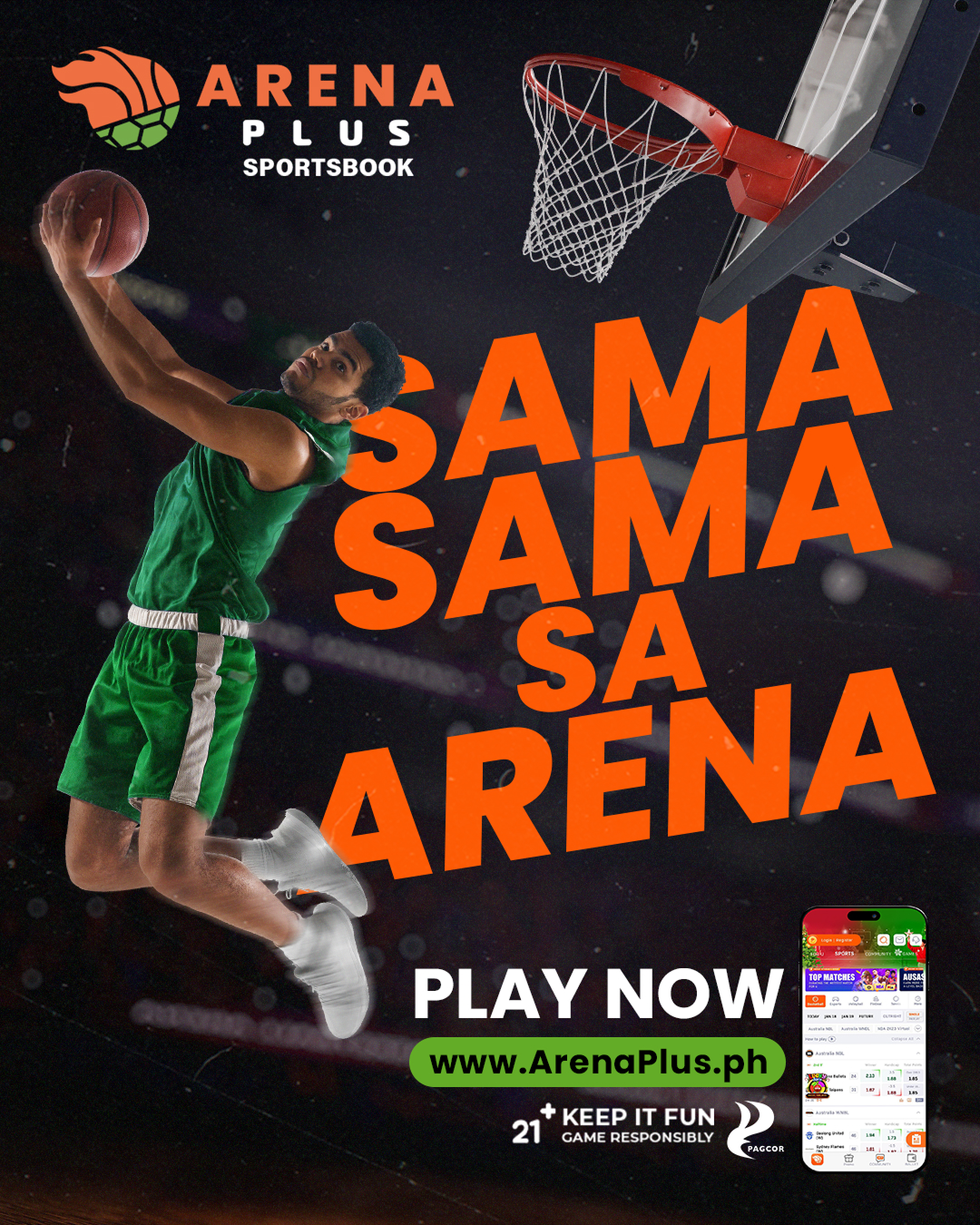
ArenaPlus approached this year with a clear goal: to strengthen and unify their brand image after a period of mixed messaging across channels. Our task was to develop a key visual that could anchor a more consistent, credible, and energizing identity for the platform.
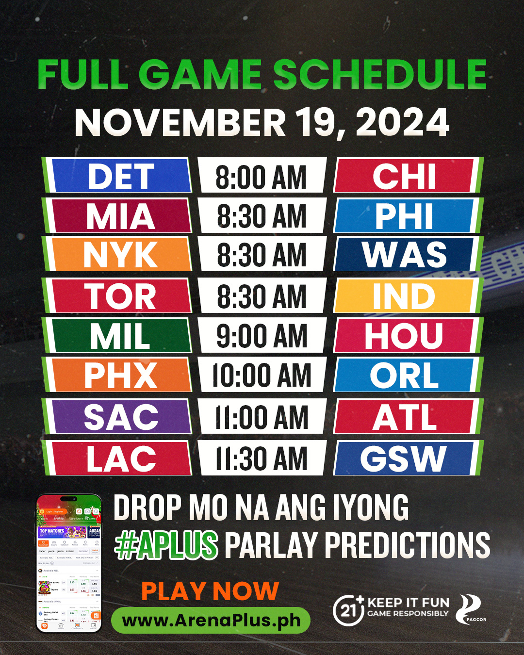
The “Sama-Sama sa Arena” concept captures that direction. It highlights the idea of shared excitement—wins that feel bigger when experienced together. To express this visually, we used a predominantly black base for a premium sportsbook tone, then contrasted it with bold orange and green accents to bring energy, focus, and strong visibility to the materials.
Dynamic action shots, expressive athlete poses, and clean composition helped establish a sense of motion and competitiveness, while optional elements like the mascot and mobile UI grounded the KV in the actual ArenaPlus experience. The minimal-noise backgrounds ensured the key elements remained sharp and impactful.
Overall, this KV serves as a foundation for ArenaPlus’ broader objectives: building credibility through consistent content, boosting engagement across multiple channels, and positioning the brand as a fun, social, and trustworthy betting platform for the community.
More Things I’ve Worked On
Let’s Work Together
Have a project, campaign, or website in mind? I’d love to help bring it to life